
Consumer
Minimalism in interior design did not suddenly change; it slowly adjusted. Early minimalist spaces focused heavily on reduction. Walls were white, forms were sharp, and surfaces were intentionally quiet. This approach created order, but over time it also revealed its limits. Many such interiors looked refined but felt distant when used daily.
Warm minimalism developed as a response to this gap between appearance and experience. Designers did not abandon minimalism. Instead, they softened it. Natural materials were brought back, colours were muted rather than erased, and texture was allowed to exist. Natural veneers and soft-tone interiors became central because they added warmth without adding visual clutter.
This text treats warm minimalism as a working design approach, not a style trend. CenturyVeneers brings an insightful guide on how materials behave, how spaces feel over time, and why restraint matters when natural veneers are used alongside soft, muted colours.
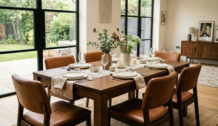
Minimalism was often judged by how empty a space looked. The assumption was simple: fewer elements meant better design. In practice, this logic did not always hold. Spaces with extreme reduction could feel cold or unfinished, especially after long hours of use.
Warm minimalism adjusts this thinking. It still values simplicity, but it no longer treats emptiness as the goal. Texture, tone, and material presence take priority over sharp contrast. This change is subtle, but it affects how people experience interiors over time.
In many cases, warm minimalism feels quieter rather than cleaner. That difference matters.
Natural veneers mean slicing real wood thin and fixing it to something solid like plywood or MDF (medium-density fibreboard). That setup makes things more stable overall and wastes less material. Designers value it because you get pinpoint control and still keep the wood's honest look.
Wood grain never repeats exactly—each sheet has its own quirks. Warm minimalist rooms count on those quirks instead of extra trim. The patterns in the grain, slight colour changes, and feel of the surface do the heavy lifting for visuals.
Veneers aren't some second-best option. Designers pick them on purpose. They give you true wood vibes with the discipline to hold back.
Wood choice shapes a room’s mood more than people realise. Light ones like ash or maple open things up nicely. Oak brings a cosy warmth but stays in the background. Darker picks, say walnut or teak, carry more weight, so they suit accents better than full coverage.
Warm minimalism banks on repeating materials for unity. Mix in too many wood types, and the space starts looking scattered. Narrow it to just a couple, and everything settles into a calm, steady feel.
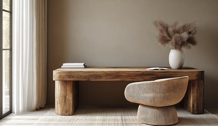
Soft tones are chosen for comfort, not neutrality alone. High-contrast colours maintain eye activity, whereas muted tones provide essential rest.
Designers typically base these schemes on warm whites, beige, sand, taupe, and light earth shades. Such palettes complement materials without vying for attention.
Natural veneers and soft tones work best when neither dominates. Soft colours recede slightly. Wood surfaces come forward just enough to be noticed.
If walls become too expressive, veneers lose impact. If veneers dominate, the space feels heavy. Most warm minimalist interiors sit somewhere in between, often after adjustment and revision.
Lighting plays a large role here. Warm, diffused light reveals texture. Harsh lighting flattens surfaces. This is a common issue in otherwise well-designed interiors.
Finish selection changes how veneers are experienced. Matte and oil finishes preserve texture and reduce glare. They feel closer to the raw material.
Glossy finishes introduce reflection and sharpness. In warm minimalism, they often feel out of place unless required functionally.
Natural veneers offer warmth without ornament and authenticity without instability. They also age more gracefully than many synthetic finishes.
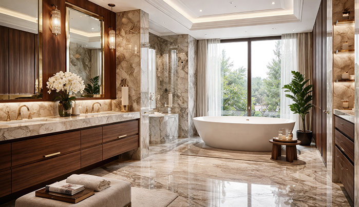
Warm minimalism allows little margin for error. Poor alignment, inconsistent finishes, or low-quality substrates become noticeable quickly.
Overuse is another issue. When every surface becomes wood, the space loses hierarchy. Even subtle contrast is necessary.
Veneers use wood efficiently. Large surface areas can be achieved using relatively small amounts of raw material. When responsibly sourced, they support sustainable interiors.
Warm minimalism also supports longevity. Spaces designed with restraint tend to age better than trend-driven designs.
Warm minimalism demands control. Materials must be limited, repetition accepted, and additions resisted.
Designers often have to stop earlier than they feel comfortable. That restraint defines the outcome.
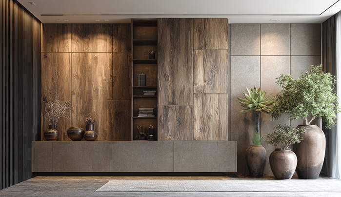
Warm minimalism marks an evolving shift in interior design philosophy. It preserves minimalism's crisp clarity yet counters its emotional coolness through thoughtful material choices. Natural veneers paired with soft-tone interiors drive this evolution forward.
Applied with precision, these elements yield spaces that convey calm, stability, and lasting appeal. Success stems from unwavering consistency, authentic materials, and disciplined restraint, not fleeting trends. Explore warm minimalism with CenturyVeneers.
It keeps the clean simplicity but goes beyond the icy white walls and sharp edges for elements like natural textures and muted colours. Spaces end up feeling lived-in and cosy over time, not empty and distant.
They're real thin wood slices glued to sturdy materials like plywood-stable, low-waste, and full of that irregular grain that does the heavy lifting instead of decorations. You get an honest wood feel without the hassle of solid slabs.
Yes, they do. Ash or maple keeps things light and airy, oak adds solid warmth without overpowering, and walnut or teak adds some depth. Pick one or two and repeat-this avoids chaos and builds that settled look.
Soft tones like beige or taupe play backup so the wood stands out just right-walls stay calm, not overpowering. Balance it, or it fails: too much colour hides the grain, too much wood drags the space down. Go for soft, even lighting to bring out texture.
Using wood everywhere overloads the space. Poor joins, patchy finishes, or weak substrates become noticeable immediately. Matte oils feel real and glare-free; shiny ones are usually unsuitable. Pull back early-restraint makes it last.
Loading categories...


