
Consumer
Walk through a newly finished home, and the wood rarely stands alone. Oak sits next to painted cabinetry. Walnut appears beside stone surfaces. Ash often shares space with metal details. The veneer still draws attention, but the surrounding materials influence the final result just as much.
Some combinations feel balanced from the start. Others never quite settle. This article covers which combinations work, how to choose for your space, and what to avoid.
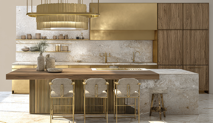
A veneer pairing combines wood veneer with another material within the same piece of furniture or interior scheme.
That second material may be:
The wood provides the grain and character. The second material changes how the veneer sits within the overall design.
Large areas finished in a single material can sometimes feel repetitive. A second finish breaks up those surfaces and introduces variation without adding unnecessary decoration.
There are practical advantages as well:
A carefully chosen pairing often feels more complete than relying on one finish throughout.
Oak has a warm appearance and a visible grain pattern. Matte black provides contrast and gives the overall design a sharper look.
Suitable applications include:
The combination feels structured without becoming overly bold.
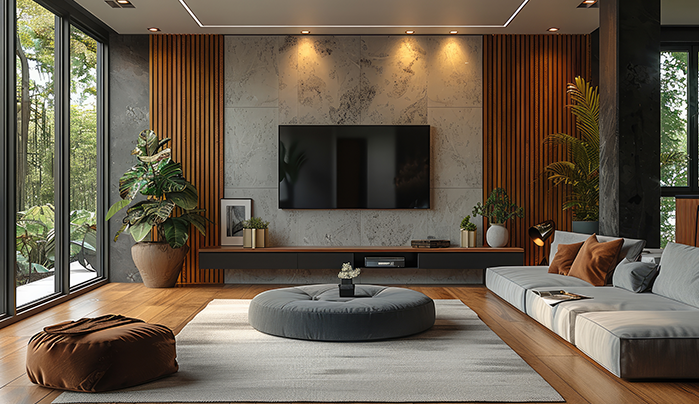
Walnut carries a darker tone and naturally draws attention. Warm cream lacquer softens the overall composition and prevents the furniture from feeling too heavy.
This pairing works well for:
Warm neutrals generally sit more comfortably beside walnut than bright white finishes.
Ash has a finer grain than many other veneer species. Brass or copper details add warmth while allowing the wood to remain the main feature.
Common applications include:
Brushed finishes generally work better than highly polished metals because they feel less dominant beside natural wood grain.
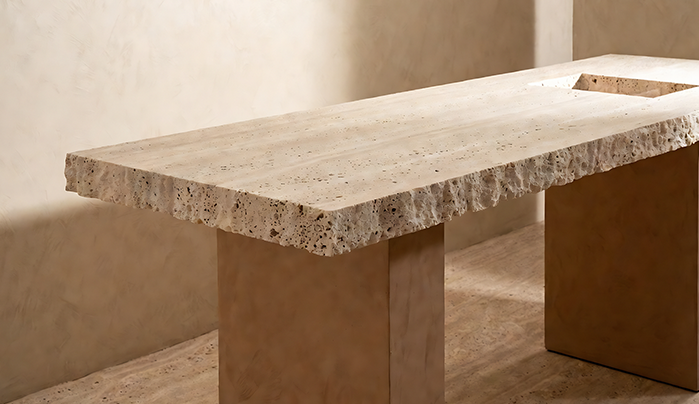
Maple remains one of the lighter veneer options available. Concrete and stone-effect finishes provide contrast without overwhelming the furniture.
This pairing suits:
Maple helps balance heavier materials and keeps the overall design feeling lighter.
Teak features a distinctive grain pattern and rich colour variation. White lacquer introduces brightness while allowing the veneer to remain prominent.
Suitable uses include:
Teak generally works best as a feature rather than a finish used throughout an entire room.
Start by looking at what already exists in the room.
Consider:
Rooms with strong natural light can accommodate darker veneers more comfortably. Smaller rooms often benefit from lighter veneers paired with lighter surrounding finishes.
One species usually establishes the main character of a room. Adding several more often creates visual competition.
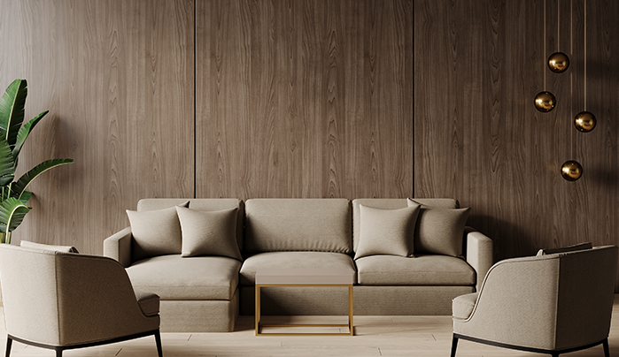
Grain direction affects how furniture is perceived. Mixed directions can appear accidental when there is no clear reason behind them.
Contrast is most effective when used selectively. Too much of it removes the areas of emphasis.
A sample board cannot show how a material will behave across a larger installation. Room size, lighting, and neighbouring finishes all influence the final result.
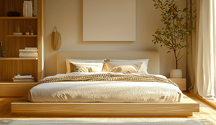
CenturyVeneers offers a wide range of veneer designs across different wood species, grains, colours, and finishes.
Some key highlights include:
The range gives homeowners and designers more choice when selecting veneer finishes for furniture and interior spaces.
Veneer rarely works in isolation within contemporary interiors. The surrounding materials influence how the grain, colour, and texture are perceived.
Most successful combinations remain relatively simple. One veneer species and one complementary material are often enough to create a balanced and visually coherent result.
One species usually establishes the main look. A second can add contrast without creating visual confusion.
Real veneer comes from timber and shows natural variation. Paper veneer repeats the same printed pattern throughout.
They do. Lighter veneers paired with softer finishes generally feel more comfortable in smaller interior spaces.
Loading categories...


